Remember - the ultimate goal is to make most things re-brandable/skinable as well.
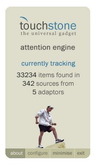
You can see the Touchstone Screenshots here.
Alpha not far away, guys - in fact thanks to the assistance of a good mate of mine (the StormWarden) who managed to crack a C# AppBar class and get the ticker docking properly. He also added to this by creating types of docks, so you can limit the docking to "Top and Bottom", "Left and Right", or "All Sides". Naturally you can set visualizations to always "float".
He has offered to extend this class so the visualization will dock to the current window with the focus, giving Chris the title bar ticker he wants SOOOOO badly.
...And now for something completely different:
Bi-Directional RSS - Something Chris and I were discussing in our deluded states last night: It occurred to me that the TouchStone outputs do not have to be restricted to the users screen. I think that the possibility of bi-directional RSS is a great idea, and it’s quite exciting because the TouchStone architecture completely accommodates this idea. TouchStone Server...might be a future side project for unilaterally dissecting, prioritizing and parsing RSS feeds and output them in a number of ways, including back into RSS.
Imagine a TouchStone UI which can administer 1000’s of RSS feeds (and other content sources) and filter them for an entire household. RSS alone takes enormous bandwidth – so it would save time and resources (not to mention precious bandwidth) if a UI were developed to determine which household members want which content and using that same UI as an adapter to another TouchStone Core, on another machine. Bi-directional RSS makes this even more powerful again, allowing people to post and reply to content as it is streamed to them live.
Fundamental Principles
Room for innovation
Even with all these great services the result is still more RSS. There is room on the edges, where users actually get their hands on the RSS, to help them digest it more effectively. Specifically:
I call these two items “Content Form Factor”.
But this is not the Form Factor that device manufacturers talk about when they talk about PDAs, Tablets, Cell phones etc – I am talking about the method that content on those devices is packaged up and delivered to your eyes (or ears) in ways that make sense based on importance, priority, relevance, context and the attention preferences or automatically generated attention profile of the participant.
The issue at hand is not how to get a user’s attention information (that’s easy) but rather how to help the user manage what their paying attention to across all the things they care about – both local and in the cloud. To service their needs intuitively.
Content as a service.
Update: All of this was obviously a prelude to our thoughts and ideas for Touchstone. We have since made some important updates and announcements about how Touchstone will help users focus their attention... these include:

I also designed a wallpaper today because I recently got two beautiful 19' Samsung monitors that needed some nice eye candy in the background!
